

1983
2015

The Logotype
As a typography lover, the biggest challenge for me is to design something with a classic approach. That means tinkering with fonts designed by some of the greatest masters.
So it's a matter of finding the font that has the right tone and then bringing the brand's personality into it.
It was a delicate job of detail and precision. After all I didn't want Mr. William Caslon turning in his grave.

The Symbol
We wanted the logo to be a classic logotype, no elements interfering with the font. But we also wanted the logo to act as a seal, making people feel like they belong to something bigger.
So we created a symbol to be known only by those who belong to this exclusive group.
Just a little detail that gives the brand a feel of brotherhood, something to be shown on a ring, a lapel or stamped on an invite for a VIP event.

TypoGRAPHY
Since we were updating one of the most traditional venture capitalist companies, the typography we chose combined a mix of traditional and modern. Headlines featured a slick sans serif with a tech tone and the body copy used our beloved Big Caslon.


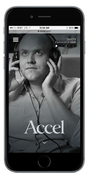
Mobile First
Accel knows very well that the Mobile world is key for new technologies. So the mobile website had to be up to par.
It had to look sexy, simple, and utilize new mobile capabilities.
So we pushed the limits on what can be done on each mobile device while making sure we weren't sacrificing design or usability.

Scaling Up
Coming from a mobile first approach, scaling up is the fun part. We used iconic imagery and slick transitions with the added real estate to bring the desktop experience to another level.
